Warranty Dashboard
Car dealerships have a designated position for employees who handle Warranty Claims called a Warranty Admin. Currently in CDK Global’s software they utilize a UI that was rushed or utilize 3rd party software to file these claims. We wanted to take a fresh look at how we allow Warranty Admins to submit new Warranty Claims and completed a massive overhaul to the UI to ensure we could replicate these designs no matter the manufacturer.
How do you design a Warranty Dashboard that is reusable for every manufacturer?
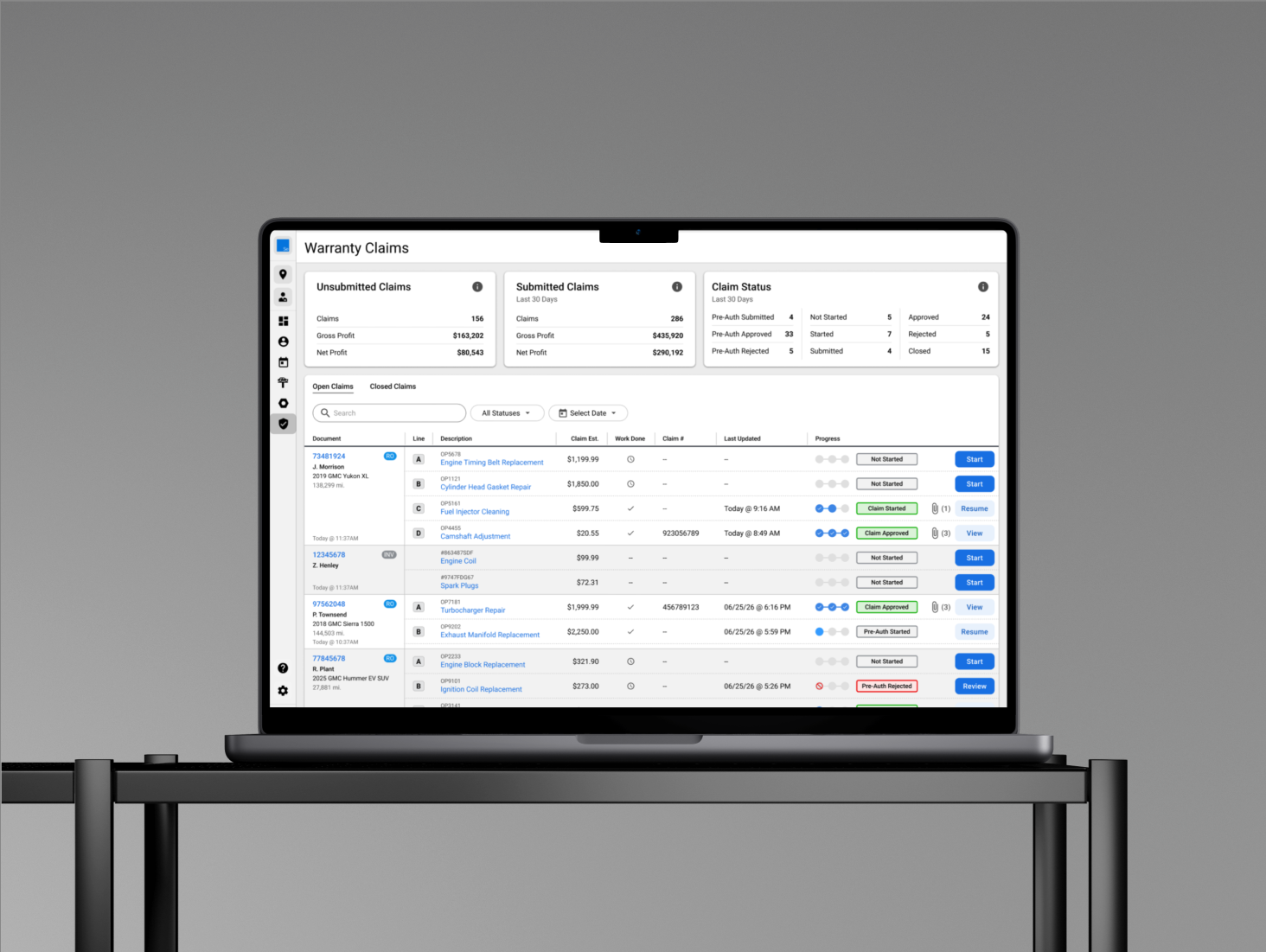
The team first started trying to make an improvement to how warranty claims are handled. However, before I worked on this project, the last team had to rush the design due to a necessary need from GMC, the car manufacturer. The team built a “repair order-centric” dashboard, which is a dashboard that is focused on a specific vehicle under service, rather than the actual claims associated to that vehicle. Unfortunately this pattern is not reusable for all manufacturers and has a few key issues that make the design flawed.
Old Design
Important Quotes
“This design is much better than what we had before, but some things about it just don’t make sense”
— Warranty Admin“I think I understand the design, but I feel like I can’t filter the way I want to.
— Warranty Admin“I feel like the statuses are off. I’m a little confused how I have 3 claims in a Repair Order where 2 are approved and 1 is not started but the overall repair order status is started.”
— Service DirectorStatuses are confusing. Every user we spoke to was unsure what exactly was going on with the statuses.
Pain Points
Filtering doesn’t make sense. You could filter to a not started status and if a repair order has multiple claims but one of them was started it would be actually hidden since one of the multiple claims had been started. This was why a repair-order centric dashboard wouldn’t work.
More data needs to be shown. Users complained it required to many clicks to see all necessary claim information.
Solutions
Statuses
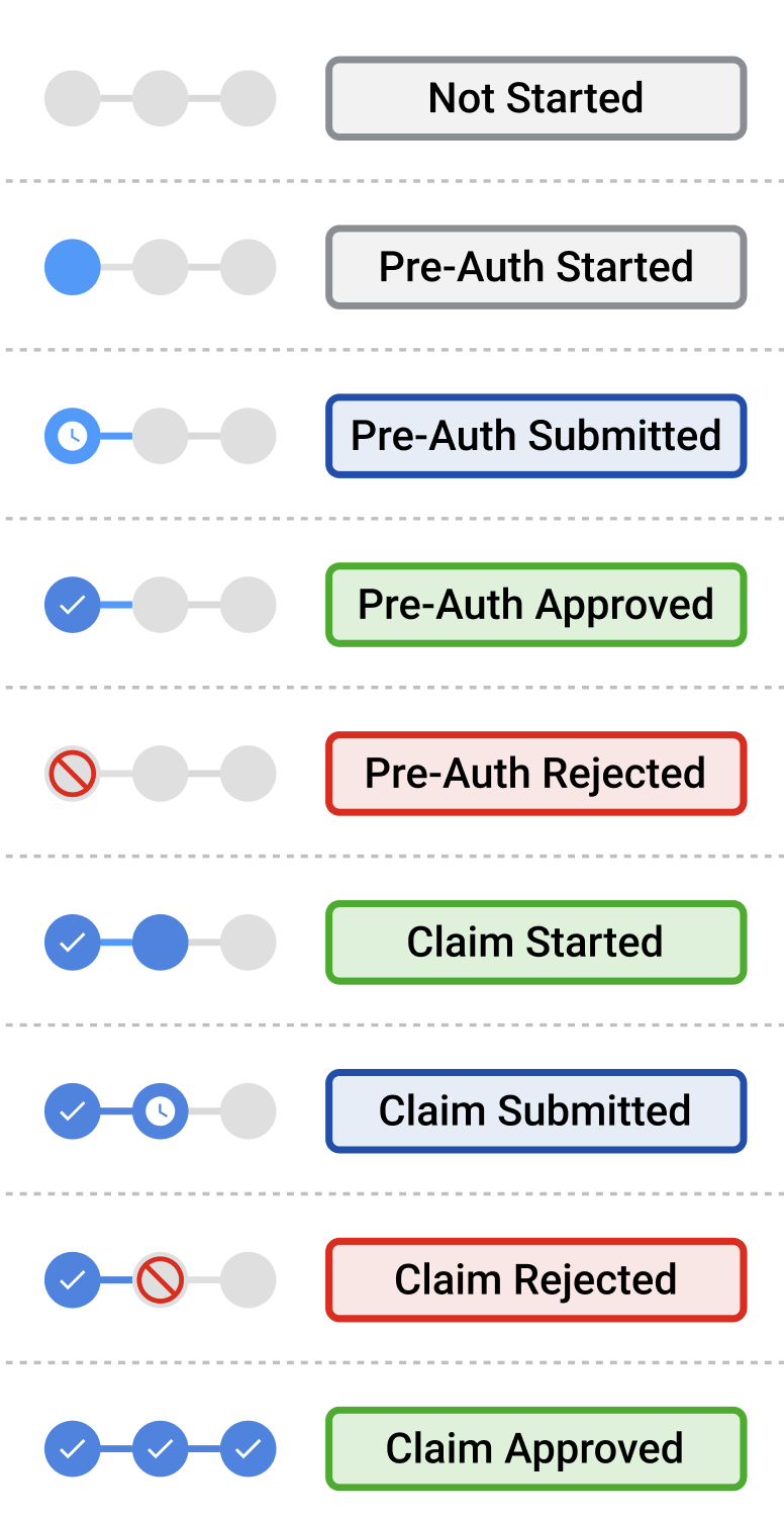
Since statuses are not clear, we decided to create a status for every stage of a warranty claim from beginning to completion. Originally there was only six generic statuses. These statuses covered a more broad view of the warranty claim submission process. To fix that we added three more statuses, and a stepper that follows the core three stages of a warranty claim; Pre-Authorization, Claim Started, and Claim Approved/Rejected. This was to ensure every user understands precisely where each warranty claim is in the warranty claim flow process.
Filtering
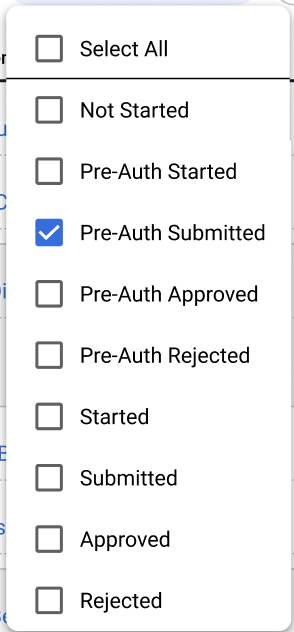
Just like the statuses, we created all nine filters as well as a “select all.” This was necessary as the repair order centric dashboard allowed filtering, but in a way that only filtered the repair orders associated with the claim. Since each repair order can have an unlimited amount of claims associated with it, users were technically seeing two different statuses in the old version. In the new version we decided to ensure it was a claim-centric dashboard where the only statuses that matter are those associated directly with a claim.

The metrics section was a new idea that came up as we looked into the prioritization of data. This turned out to be something every Warranty Admin we spoke to wanted. By having these metric they’re able to communicate to their management the exact financial impact of their submitted and unsubmitted warranty claims.

In the previous version, there were areas of the UI that either hid or didn’t show specific data elements users find important. Through qualitative research we prioritized the most important data to ensure it was always visible and no clicking was necessary. This included adding specific metrics and customer information such as what’s seen to the right. The picture below shows the new organization of the warranty claims layout. You can see the repair order number as well as vehicle and customer information. Then to the right you can see each warranty claim line (A, B, C, & D) and all necessary warranty claim data.
Data Clarity
New Design
This screen was the final product after testing. This page turned into our one-stop shop for all warranty claims metrics, data, and actions. This design can be universally used for all manufacturers we conduct business with and expedites the time it takes to submit each claim.
Open Filters
When a filter is selected it will narrow your claim results based upon the selected item.
Closed Claims
All closed claims are now in a tab located in the top left. This helps eliminate claims that are just taking up space on the warranty dashboard and causing unnecessary scrolling.
Side sheet
For all data that was considered non-critical we utilized a side sheet. The side sheet breaks down the labor operations (LOPs) for the associated service for the claim. We also provide extra data such as the advisor handling the repair order as well as the total costs.
The Final Product
In this demo here, you can view the prototype we used for testing. With prioritization around the listed pain points as well as limiting the number of clicks for our users, we were able to successfully increase our SUS score by 15%
The Final Result
After testing with 5 users, the final SUS score came out to 86% which is a 15% increase from the previous warranty dashboard which was 71%.